In the 2008 election for Senator from Minnesota between Al Franken and Norm Coleman was decided only after a lengthy recount and legal battle that lasted over 8 months. One of the biggest controversies centered on absentee ballots and deciding which of them were even eligible to be counted. A shockingly high number were disqualified because the “envelope” (with the voter’s identification and signature and witness signature) were not completed correctly. In other words, citizens who had gone out of their way to receive and return a ballot did not have their votes counted.
After the election was over, Minnesota decided to revise the instructions for absentee ballots to try to reduce the number of ballots which are disqualified. The Brennan Center asked the Usability in Civic Life project to review the draft changes to the election law. What we received was a typical markup.
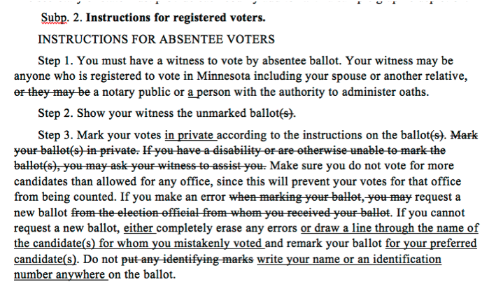
We said that just fixing the language was not enough; that the design and presentation of the instructions is critical to the usability of the materials. Beth Fraser, the project leader from the Minnesota Office of the Secretary of State, agreed to work with us. That started a 3-month volunteer project to redesign (and test) the absentee ballot instructions and return envelope forms.
One problem is that the “simple” act of voting is really very complicated. In Minnesota, there are three types of absentee voting (depending on whether the voter is in the US or temporarily overseas), and at least two different styles of envelopes.
The work itself proceeded like many plain language projects, in rounds of editing and review as we tried out different ways to organize the steps of the process into clear and usable instructions. Starting from the old version and the draft rule we re-organized the steps into logical voter-focused groups, untangled sentences, cut extra words, and created illustrations for each step.
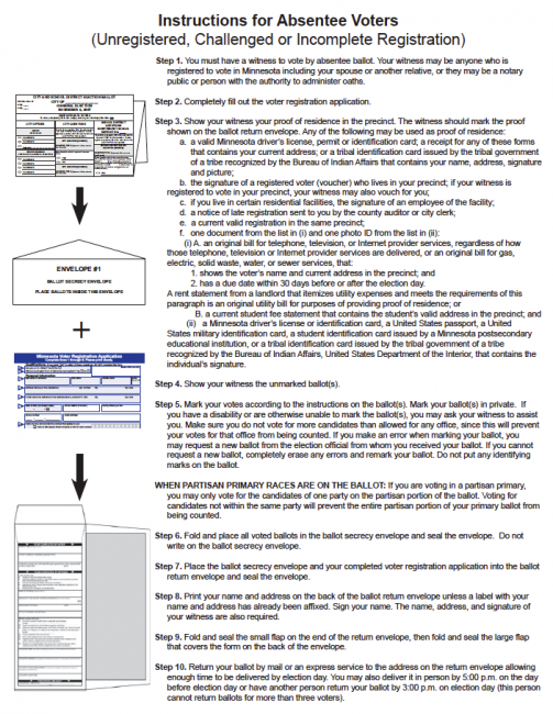
Here’s how the instructions evolved. These clips are from the most complicated type of absentee ballot, in which voters update their voter registration and vote. In the instructions, Step 1 is to complete the registration form before voting. In Minnesota, someone must witness the voting. They check the blank ballot and then observe (from a distance) as the voter marks it and places it in the envelope. The original instructions included a long paragraph that included information about how to vote.
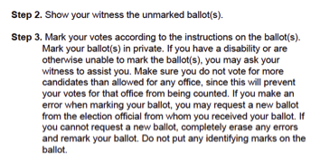
Our first step was to untangle the text. We kept the basic organization of the instructions, but broke it into bullet points and simplified the language.
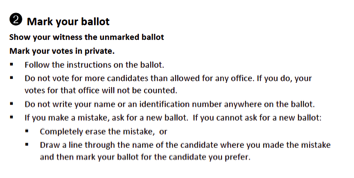
As we continued to revise, we added emphasis, made the instructions more specific and removed text that was duplicated on the ballot itself. A team of volunteers and official staff did a usability test of this version, and found that it was still too complicated.

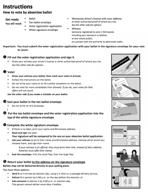
For the second usability test, the text was simplified further. Instructions for correcting a mistake were moved to the back of the paper. This worked better, but there was still some legal language (“invalidate your ballot”).
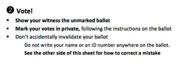
The final version simplified the bullets into a single list and re-organized the first sentence for clarity about voting privacy. After the legal and public review, some information we had left off (like the warning not to vote for too many candidates) was restored.

The person who deserves the most credit for the success of this project is Beth Fraser. She took on the challenge of working with a group of volunteers located both in Minneapolis and around the country. She also managed the process of reviewing our drafts for legal accuracy and to ensure that they supported the election process. But most of all, she and her colleagues learned about usability, and ran the second usability test on their own.
More reading:
- Minnesota Absentee Ballot Instructions: From recount to clarity – Presentation slides from Clarity 2010, Lisbon, Portugal.
- Ballot Design Affects Your Vote – Center for Plain Language, November 10, 2010
- Better Ballots by Lawrence Norden, David Kimball, Whitney Quesenbery and Margaret Chen. The Brennan Center, July 2008
This post is adapted from an article in Clarity 65 (May 2011), the journal of Clarity, the international association promoting plain legal language.
Credits: Many people worked on this project.
- Office of the Minnesota Secretary of State: Beth Fraser, Andy Lokken, Michele McNulty, Gary Poser;
- UPA Usability in Civic Life: Whitney Quesenbery, Dana Chisnell, Josie Scott, Caroline Jarrett, Sarah Swierenga • Center for Plain Language: Dana Botka, Ginny Redish
- Usability testing: David Rosen, Josh Carroll, Suzanne Currie, John Dusek, Gretchen Enger
- Illustrations: Christina Syniewski
